Cream is having a moment, and for good reason. Unlike stark white that can feel cold or dated neutrals that fade into the background, cream strikes a perfect balance: warm, inviting, and versatile enough to work with nearly any accent color. Whether you’re refreshing your home’s exterior or reimagining interior spaces, cream color schemes offer a timeless foundation that doesn’t scream trend or require a full repaint in five years. This guide walks you through selecting cream shades, pairing them with complementary accent colors, and implementing your chosen palette across both indoor and outdoor spaces. We’ll skip the inspiration-board fluff and focus on practical decisions that actually stick.
Table of Contents
ToggleKey Takeaways
- Cream color schemes offer a warm, versatile neutral that balances modern appeal with timeless longevity, outperforming stark white and dated beige for both interior and exterior spaces.
- Pair cream exteriors with warm accents like rust and terracotta for traditional charm, or cool accents like navy and forest green for contemporary sophistication—always test samples in full daylight before committing.
- Interior cream walls create a flexible canvas for accent walls, trim, and furnishings; combine with white trim, natural materials, and deeper tone accents to add personality without overwhelming the space.
- Quality cream paint covers 350–400 square feet per gallon; budget for two coats on all surfaces and invest in proper primer ($20–$40) to save on paint costs and ensure even coverage.
- Successful cream color implementation requires sample testing under multiple lighting conditions, thorough surface prep including sanding and priming, and a realistic two-coat application timeline to achieve a polished, intentional finish.
Why Cream Is the Ultimate Neutral Choice for Modern Homes
Cream works where other neutrals stumble. It contains enough warmth to feel human and welcoming, yet remains neutral enough to complement virtually any design direction. Unlike beige, which can look tired or dated, cream feels intentional and clean. Unlike pure white, it doesn’t bounce glare or highlight every smudge and shadow on your walls.
From a practical standpoint, cream is forgiving. It hides minor imperfections better than white, requires less frequent repainting than lighter shades, and serves as an ideal backdrop for artwork, furniture, and architectural features. For homeowners planning to sell, cream signals sophistication and broad appeal to potential buyers, it’s perceived as a deliberate, neutral choice rather than a cop-out.
Building code and paint coverage? Standard cream paint covers about 350–400 square feet per gallon, depending on surface prep and sheen. Plan for two coats on most interior walls and at least two coats on exterior surfaces. A 5-gallon bucket of quality cream paint typically runs $50–$120 depending on the brand and whether you’re using interior latex or exterior acrylic.
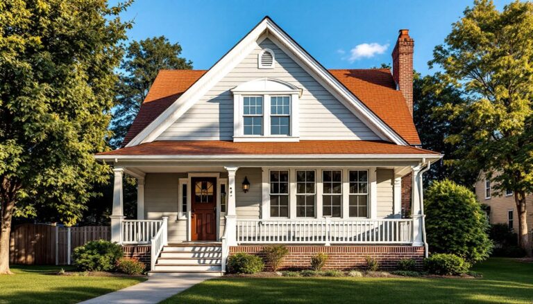
Exterior Cream Color Schemes That Boost Curb Appeal
Your home’s exterior sets the tone before anyone steps inside. Cream as a primary exterior color is classic, it reads clean, well-maintained, and inviting. The key is choosing accent colors that enhance rather than clash.
Cream With Warm Accent Colors
Warm accents, rust, terracotta, warm grays, and soft golds, amplify cream’s inherent warmth. A cream body with a burnt sienna or rust-red trim (think traditional farmhouse or cottage style) creates strong visual interest without feeling chaotic. Deep charcoal or warm taupe for doors and shutters grounds the palette and prevents the facade from looking washed out.
Consider the undertones in your cream paint. A cream with yellow undertones pairs beautifully with warm accents: a cream leaning slightly pink or gray may clash with aggressive rust. Paint samples on your home’s actual exterior, not indoors under artificial light, and observe them at different times of day. Shadows change perception significantly.
Designers at House Beautiful highlight exterior palettes like cream with warm accent tones as proven crowd-pleasers that boost curb appeal year-round.
Cream With Cool Accent Colors
Cool accents, navy, forest green, slate blue, and charcoal, create a modern, sophisticated contrast against cream. Navy trim and doors on a cream body is contemporary without feeling trendy: it’s been holding strong for over a decade. A cream facade with deep forest green shutters or a green front door works especially well on homes with natural landscaping or stone elements.
The contrast is more dramatic here, so ensure your cream is a true cream (not too yellow or pink) and your accent is genuinely cool-toned. Undertone mismatches are more obvious with cool palettes. Metallic accents like brushed nickel or matte black hardware against cool-cream-plus-navy reads sharp and intentional.
Always test samples on your home in full sun and shade. Exterior paint can shift considerably under different lighting, and a swatch you loved in the paint aisle may surprise you once applied to actual siding.
Interior Color Combinations That Work With Cream
Inside, cream serves as both a primary wall color and an excellent canvas for accent walls, trim, and furnishings. Cream walls with white or off-white trim and ceiling creates a cohesive, light-filled interior that makes spaces feel larger. For a softer approach, pair cream walls with warm white trim (slightly warmer than pure white) to avoid an overly stark look.
Accent walls in deeper tones, soft sage, warm gray, navy, or even a muted terracotta, anchor a room when paired with cream surrounds. A cream living room with one sage accent wall, cream upholstery, and natural wood tones feels balanced and intentional. Cream also pairs well with natural materials: light oak, walnut, whitewashed wood, and concrete all complement cream without competing.
For kitchens, cream cabinetry with cream walls and stainless steel hardware creates a timeless, clean aesthetic. Introduce warmth through countertops (natural stone, butcher block) and backsplash materials. Bathrooms benefit from cream walls paired with white subway tile or larger format ceramic tile, warm brass or brushed gold fixtures, and wood accents (vanity, floating shelves).
Interior design inspo from Home Bunch and Young House Love shows countless examples of cream-based interiors that balance simplicity with personality through thoughtful furnishing, lighting, and accent colors. The takeaway: cream walls don’t mean boring interiors, they’re a launchpad for intentional design choices.
Practical Tips for Selecting and Implementing Cream Paint
Start with samples. Purchase sample pints ($5–$10 each) in three to five cream options from different brands. Apply each to a large poster board or directly on drywall in an inconspicuous area. View them at different times, morning light, afternoon glare, evening lamp light, and across multiple rooms if possible. Cream undertones vary wildly: some lean yellow, others pink, gray, or even slightly green. What looks good under fluorescent lighting at the store may feel off in natural daylight at home.
Check the sheen. Interior walls typically use eggshell or satin finishes, they’re easier to clean than matte and don’t look overly glossy. Matte finishes hide imperfections but are harder to wipe clean. For trim and doors, semi-gloss or satin holds up better to handling and wiping. Exterior cream requires exterior acrylic or latex paint with a satin or semi-gloss finish for durability and weathering.
Prep is non-negotiable. Sand walls lightly to remove gloss or loose paint, fill holes and gaps with spackle (sand smooth once dry), and prime any new drywall, patched areas, or previous dark colors. A quality primer ($20–$40 per gallon) is cheaper than buying extra paint to achieve coverage over old stains or colors. On exteriors, clean siding thoroughly, scrape loose paint, and allow time for surfaces to dry completely, typically 24–48 hours, before painting.
Plan for two coats. Budget time and materials for a second coat, applied 4–8 hours after the first (check your paint can for exact recoat time). One coat rarely provides adequate coverage or color depth, especially over previous colors or on bare wood.
Safety and PPE. Wear safety glasses to prevent drips in eyes, nitrile gloves (latex can break down with some paint solvents), and a respirator or N95 mask when spraying or working in poorly ventilated spaces. Use ear protection if operating power tools or sanders. Ensure ladders are stable and set on level ground, and never reach beyond arm’s length from a ladder, reposition instead.
Conclusion
Cream color schemes deliver versatility, warmth, and longevity that justify their popularity in both traditional and modern homes. The real work isn’t choosing cream, it’s selecting the right undertone, pairing it thoughtfully with accents, and executing the paint job with proper prep and technique. Take time with samples, respect the prep work, and don’t rush the application. A cream interior or exterior done right looks intentional and polished: done hastily, it just looks incomplete. Start small if you’re uncertain, a single room or accent wall, then expand your palette once you’re confident in your selections.